New York Mets Logo History
The New York Mets have a rich history closely tied to their iconic logo. The team was established in 1962 as a replacement for the National League's departed New York Giants and Brooklyn Dodgers franchises. From the beginning, the Mets' logo has been an integral part of their identity and has undergone several changes over the years.
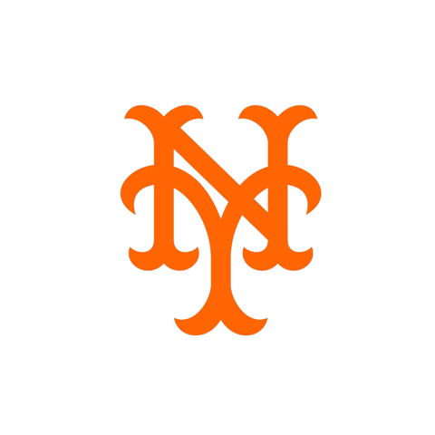
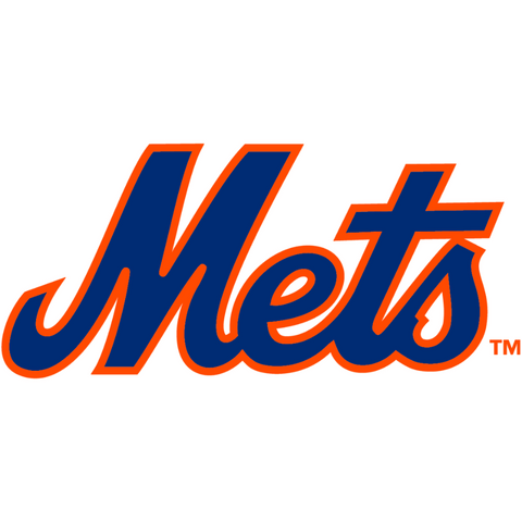
The original Mets logo, designed by sports cartoonist Ray Gotto, featured a baseball with the word "Mets" in blue and orange script lettering over a white background. This simple and understated logo reflects the team's modest beginnings as an expansion franchise. However, it did not have the same impact as some of the more iconic logos in baseball history, and the team's management decided that they needed a new design to capture the attention of fans.
In 1963, the Mets unveiled a new logo that would become more recognizable. This logo featured a white baseball with orange stitching. It was set against a blue background shaped like a home plate. "Mets" was emblazoned across the baseball in bold block letters. The entire design had a strong graphic quality easily recognizable from a distance. The logo was created by sports artist Lon Keller, who was commissioned by the team to develop a new design that would capture the essence of New York City.
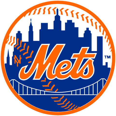
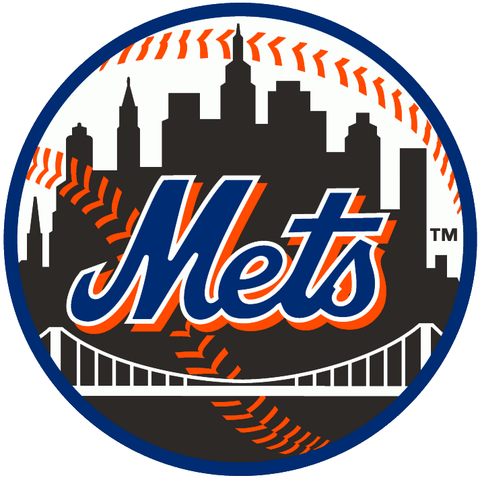
Over the years, the Mets logo has undergone several revisions and updates, but the basic elements have remained the same. In the late 1990s, the team introduced a new logo incorporating a silhouette of the New York City skyline in the background. This version of the logo was intended to give the team a more modern and contemporary feel, and it was well-received by fans and critics alike. However, in recent years, the Mets have returned to the classic design that made their logo famous, and they have once again become one of the most iconic teams in baseball.
Today, the Mets logo is instantly recognizable to fans of all ages, and it has become a symbol of the team's storied history and enduring legacy. Whether you're a die-hard Mets fan or just a casual observer of the sport, there's no denying the power and impact of this iconic design. From the franchise's early days to the present day, the Mets logo has been an integral part of the team's identity. It will continue to be an important symbol of baseball history for generations.
Mr. Met Mascot & Logo
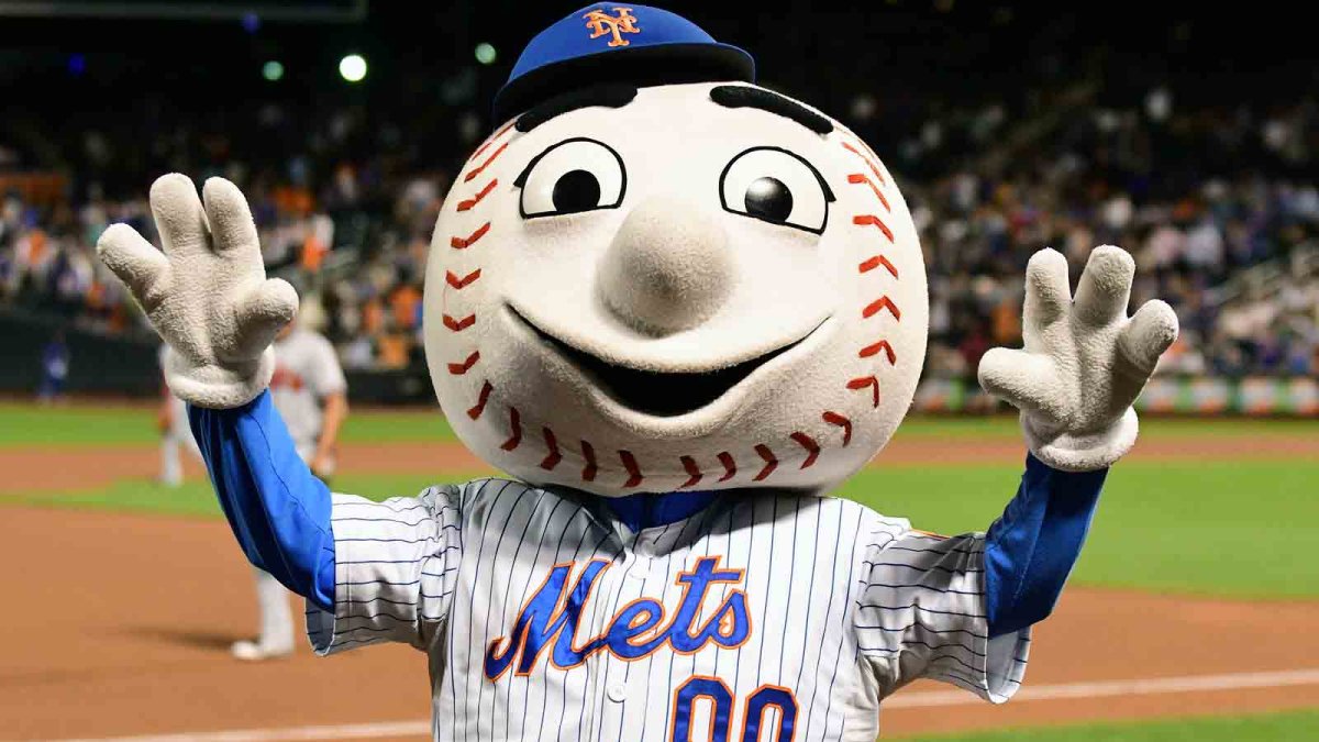
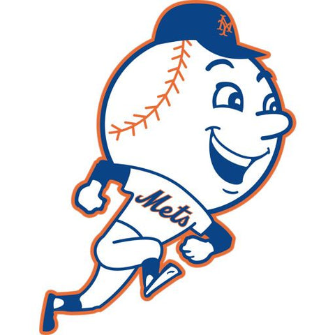
Mr. Met is the official mascot of the New York Mets. The character was first introduced in 1963. Today, Mr. Met is a beloved figure among fans, and is often seen at games, events, and promotional materials. The Mr. Met logo features a stylized version of Mr. Met's head, which is a large baseball with a smile and a pair of baseball stitching, and eyes wearing a Mets cap. This logo is commonly used on merchandise, hats, and apparel to represent the Mets team.
For more information about sports logos history visit the Sports Logos section of our website.
New York Mets Logo History
1962 - 1992
|
1962 -1992
|
1993 - 1998
|
1993 - Present
|
1994 - 2014
|
2013 - Present
|
2014 - Present
|